7 Trending Business Card Colors for 2025
11 minutes
11th of October 2025
In this article:
- The Impact of Color in Business Card Design
- 7 Trending Business Card Colors for 2025
- How to Choose the Right Business Card Color for Your Brand
Business card colors are reshaping first impressions and setting professionals apart in today’s fast-paced networking world. Colorful cards now influence brand recall and card retention, with studies showing people keep vibrant designs up to ten times longer than plain cards.
As design trends shift rapidly, staying ahead of 2025’s most impactful business card colors will help you make a memorable entrance at every event or meeting. In this article, you’ll discover the top seven business card colors for 2025, what each color means, where they work best, and expert tips to make your next card stand out.
The Impact of Color in Business Card Design
Color is one of the most influential elements in business card colors, shaping how others perceive your brand and setting the tone for every interaction. The right choice can make your card memorable, credible, and visually distinct in a crowded marketplace.
The Psychology Behind Color Choices
Colors evoke powerful emotions and influence how people respond to business card colors. Blue, for example, is often linked to trust and professionalism, making it a favorite among finance and tech companies. Yellow radiates optimism and creativity, while black signals sophistication and exclusivity.
Selecting the right business card colors can enhance brand credibility and make your card more memorable. In fact, studies show people keep colorful cards up to ten times longer than plain ones. However, color meanings can differ across cultures, so it is crucial to consider international audiences. Brands like Tiffany & Co. (with its iconic blue) and National Geographic (with its yellow border) show how strategic color use reinforces brand identity.
For a deeper dive into how different colors impact perception and behavior, explore Color Psychology in Branding.
Color Trends in Branding and Print for 2025
The landscape of business card colors is shifting toward bold, expressive hues. Graphic design forecasts point to vibrant shades—such as electric blue and luxe purple—appearing in both digital and print branding. Pantone’s Color of the Year and other industry insights continue to inspire creative palettes.
Brands are now blending digital and physical experiences, using business card colors that feel modern and personalized. Tech startups, wellness brands, and creative agencies are leading this trend by choosing non-traditional colors that break away from the typical white or beige cards. Personalization is also on the rise as companies seek unique color combinations to reflect their distinct identity.
Why Color Matters More Than Ever in Networking
Business card colors play a vital role in networking success. Research indicates that distributing 2,000 cards can boost sales by 2.5 percent, but only if the cards are memorable and engaging. Colorful business card colors make your card more likely to be noticed, shared, and remembered after an event.
Differentiation is essential in professional environments. A vibrant card stands out among a sea of minimalist designs, increasing the chances of follow-up. Multi-color, gradient, and metallic finishes are trending, offering even more ways to make business card colors visually distinct and associated with your brand.
Mistakes to Avoid When Choosing Business Card Colors
Choosing business card colors requires careful consideration to avoid common pitfalls. Poor contrast between background and text can result in illegible information. Ignoring brand guidelines or using clashing hues may confuse your audience rather than impress them.
Overusing trendy colors without aligning them to your brand identity can undermine professionalism. It is also important to ensure consistency between print and digital versions of your business card colors. To strike the right balance, prioritize readability, industry norms, and creativity—making sure every color choice strengthens your brand message.
7 Trending Business Card Colors for 2025
The world of business card colors is evolving at a remarkable pace. As we move into 2025, color choices are not just about aesthetics. They serve as powerful tools for brand expression, memorability, and connection in a crowded marketplace. Below, discover the 7 most influential business card colors for 2025, what they mean, the industries leading the trend, and actionable tips for making each color work for your brand.

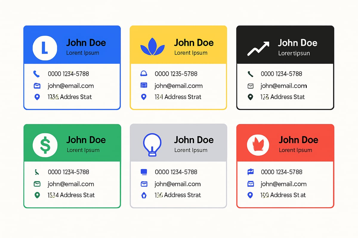
1. Electric Blue
Electric blue is leading the charge in business card colors for 2025. This vibrant shade symbolizes trust, innovation, and professionalism. It is a favorite among tech startups, finance professionals, and consulting firms who want to project authority while remaining approachable.
When you select electric blue for your business card colors, you instantly communicate credibility. Studies show that blue is one of the most used business card colors in professional design, largely due to its association with reliability and intelligence. Law firms, SaaS companies, and corporate consultants frequently choose electric blue to reinforce their reputations.
Electric blue stands out in both print and digital formats. Pairing it with white or silver accents gives your card a modern, clean edge that is both eye-catching and easy to read. If you want to embrace the 2025 vibe, try using blue gradients or geometric patterns for added depth and visual interest.
Design Tips:
- Use electric blue as a bold background with crisp white text for maximum legibility.
- Incorporate subtle gradients for a tech-forward look.
- Pair with geometric patterns or silver foil for a futuristic touch.
Who Should Use Electric Blue?
- Startups wanting to convey innovation.
- Corporate professionals seeking credibility.
- Consultants aiming for a balance of authority and approachability.
According to Color Psychology in Marketing and Branding, blue evokes feelings of trust and dependability, making it a powerful choice for business card colors in fields where confidence is key.
2. Vibrant Yellow
Vibrant yellow is quickly gaining traction as one of the most memorable business card colors for 2025. This energetic hue represents optimism, creativity, and forward-thinking. If your brand is all about positivity and new ideas, yellow can set you apart from the crowd.
Yellow business card colors are especially effective for nonprofits, gyms, children’s brands, and creative agencies. The color is proven to grab attention and improve card retention rates. In fact, people are more likely to keep a bright yellow card, especially when paired with bold black or white text for clarity.
Design Tips:
- Use matte finishes to reduce glare and keep the card readable.
- Pair yellow backgrounds with playful graphics or icons.
- Choose bold typography for maximum impact.
Industry Examples:
- Nonprofits use yellow to convey warmth and hope.
- Creative agencies opt for yellow to highlight originality.
- Gyms and children’s products benefit from yellow’s energetic vibe.
Research shows that bright backgrounds enhance the legibility of contact information. When you choose yellow as your business card colors, you’re making a statement that is both cheerful and memorable.
3. Deep Black
Deep black is synonymous with luxury, sophistication, and exclusivity. As one of the most striking business card colors, black makes a dramatic impact, especially in industries where status and elegance matter.
Fashion brands, tech executives, and luxury service providers often select black for their business card colors to signal high standards and premium offerings. Black cards frequently feature gold foil or embossed elements, further elevating the tactile and visual experience.
Design Tips:
- Use high-contrast metallic or white text for readability.
- Opt for gold or silver foil accents to add a premium feel.
- Choose thick, textured card stock to enhance the sense of exclusivity.
Who Should Use Deep Black?
- CEOs and executive-level professionals.
- Luxury brands in fashion, jewelry, or automotive.
- Tech leaders aiming for a sleek, modern look.
Data suggests that black business card colors are perceived as elegant and eye-catching, helping professionals leave a strong first impression. Minimalist layouts with ample white space prevent black cards from feeling overwhelming, ensuring your brand remains approachable yet exclusive.
4. Fresh Green
Fresh green is emerging as a top choice for business card colors in 2025, especially among brands focused on wellness, sustainability, and growth. Green symbolizes renewal, health, and a connection to nature, making it perfect for those who want to project environmental consciousness.
Gyms, health coaches, and eco-friendly brands are leading the way with fresh green business card colors. The color instantly communicates values like vitality, responsibility, and forward momentum.
Design Tips:
- Choose shades of green that reproduce well in print, such as those using CMYK processes.
- Pair green with natural textures or recycled paper for added authenticity.
- Combine with neutral or earthy tones to reinforce a sustainable message.
Industry Examples:
- Wellness professionals use green to evoke calm and growth.
- Eco-brands choose green to highlight sustainability.
- Fitness companies leverage green’s association with energy and health.
It is important to note that green can be challenging to print accurately, so always test your business card colors before finalizing your design. A well-executed green card not only stands out but also reinforces your commitment to positive change.
5. Modern Gray
Modern gray is making a subtle yet powerful statement among business card colors in 2025. This shade exudes modernity, neutrality, and understated elegance. While less common than white or black, gray cards are memorable for their sophistication and versatility.
Creative agencies, consultants, and marketing professionals are increasingly turning to modern gray business card colors to distinguish themselves in a refined way. Gray pairs beautifully with intricate illustrations or pops of color, allowing for creative freedom without sacrificing professionalism.
Design Tips:
- Use textured paper for tactile interest and a premium feel.
- Combine gray backgrounds with minimalistic layouts for clarity.
- Add small bursts of color or custom illustrations to make your card stand out.
Who Should Use Modern Gray?
- Professionals seeking subtle distinction.
- Creative agencies wanting a neutral yet impactful base.
- Consultants who value versatility and modern appeal.
Data shows that gray business card colors are especially effective when paired with custom artwork or unique finishes. The result is a card that feels personal, polished, and perfectly suited for networking in 2025.
6. Bold Red
Bold red is not for the faint of heart. As one of the most attention-grabbing business card colors, red represents confidence, passion, and action. It is the color of leaders who are not afraid to stand out and make a statement.
Tech leaders, sports brands, and entrepreneurs are increasingly adopting bold red business card colors to create unforgettable first impressions. Red is rarely used, which makes it highly memorable when executed with care.
Design Tips:
- Balance bold red with ample white space to avoid visual overload.
- Use simple, clean typography for a professional look.
- Limit additional colors to maintain focus and impact.
Industry Examples:
- Tech startups use red to signal innovation and urgency.
- Sports brands leverage red’s energetic qualities.
- Entrepreneurs favor red for its association with boldness and drive.
When you choose red business card colors, you are telling the world that your brand is dynamic and decisive. Just remember, a little red goes a long way, so use it strategically for maximum effect.
7. Luxe Purple
Luxe purple is climbing the ranks as a favorite among business card colors for 2025. Known for symbolizing creativity, wisdom, and luxury, purple bridges the gap between tradition and innovation.
SaaS companies, designers, wellness experts, and coaches are increasingly choosing purple business card colors to express uniqueness and sophistication. Abstract patterns or gradients can add a modern twist, while silver accents elevate the sense of luxury.
Design Tips:
- Use gradients to create depth and visual intrigue.
- Pair purple with silver or white for a clean, modern look.
- Experiment with abstract patterns for added personality.
Industry Examples:
- SaaS brands use purple to highlight innovation.
- Wellness experts choose purple for its calming yet luxurious vibe.
- Designers and coaches favor purple for its creative associations.
According to recent trends, purple business card colors are especially popular in SaaS and wellness branding. If you want to signal creativity and stand out, purple is a compelling choice for your 2025 business cards.
How to Choose the Right Business Card Color for Your Brand
Selecting the most effective business card colors is a strategic decision that goes beyond aesthetics. The right hues can reinforce your brand’s message, appeal to your target audience, and ensure your card stands out in a competitive landscape. Let’s break down the process into actionable steps, from understanding your brand’s core identity to embracing sustainability in modern business card design.
Assessing Your Brand Identity and Audience
The foundation of choosing business card colors is a deep understanding of your brand’s values and the audience you want to reach. Start by reviewing your brand’s mission, personality, and unique selling points. Ask yourself, what emotions or messages do you want your business card to convey?
Consider color psychology and its influence on perception. For example, blue can signal trustworthiness, while yellow evokes creativity. If you want to explore this further, Color Psychology in Marketing: The Ultimate Guide offers an in-depth look at how color choices impact branding. Remember to research your competitors’ cards and gather feedback from your target market. Adapting your color choices for different cultures or markets can also boost recognition and recall.
Industry-Specific Color Recommendations
When selecting business card colors, it’s vital to consider the standards and expectations within your industry. Certain colors are consistently linked to specific sectors, helping you establish credibility and appeal to the right clients.
| Industry | Recommended Colors |
|---|---|
| Tech | Electric Blue, Black, Purple |
| Wellness | Green, Purple, Gray |
| Creative | Yellow, Pink, Orange |
| Finance | Blue, Gray, Black |
Industry leaders often leverage these associations to their advantage. For instance, a tech startup may opt for electric blue to signal innovation, while a wellness coach uses green to promote growth and renewal. Selecting the right business card colors can elevate your professional image and foster trust within your field.
Practical Design Tips for 2025
To maximize the impact of your business card colors in 2025, use color strategically across backgrounds, accents, and typography. Combine contrasting hues for clear visual hierarchy and legibility. Matte, gloss, metallic, and textured finishes can add tactile interest and differentiate your card.
Stay up to date with print technologies and trends, such as gradients or foil detailing for a modern look. Always ensure your business card colors are accessible for all users, including those with visual impairments. For further insight on how color shapes brand perception, Color Psychology in Branding: Find the Right Color for Your Brand is a valuable resource.
Sustainability and Digital Alternatives
As sustainability becomes central to branding, your business card colors can reinforce your eco-friendly message. Opt for recycled or responsibly sourced materials and choose colors that align with a natural or green ethos.
Digital business cards are also on the rise, offering customizable business card colors, interactive features, and instant updates. Brands adopting digital options not only reduce waste but also increase engagement through shareable, dynamic content. No matter the format, ensure your business card colors remain consistent across both print and digital platforms for a cohesive brand experience.
Now that you’ve seen how powerful color choices can shape first impressions and help your business card stand out in 2025, why not take the next step and experience it for yourself? With Spreadly, you can easily create and customize a digital business card that reflects your unique style, brand colors, and personal touch—no design experience needed. You’ll be ready to network with confidence, share your card anywhere, and keep it up to date in real time. If you’re ready to explore the latest trends and elevate your professional presence, try for free.