Name Card Guide: Design, Layout and Tips
8 minutes
14th of November 2026
In this article:
- What Is a Name Card and What Should It Include?
- Which Name Card Size Should You Use?
- How Do You Lay Out a Name Card?
- What Typography and Color Work Best?
- How Do You Prepare a Name Card for Print?
- What Are the Limits of a Printed Name Card?
- How Does a Digital Name Card Work at Events?
- How Can Companies Keep Every Name Card Consistent?
- Which Name Card Format Fits Which Situation?
- How Do You Evaluate a Name Card Before Using It?
A name card is a small card that carries a person's name, job title, company and contact details, handed over at meetings and events so the other party can reach you later. The best ones are legible at a glance, sized to fit a standard wallet slot, and tied to a contact record that stays current. This guide covers sizes, layout, typography, print preparation and the digital options that matter for teams working trade shows.
What Is a Name Card and What Should It Include?
A name card is a compact professional introduction, and its content should be limited to what a recipient needs to contact you and place you in context.
Include these elements, in roughly this order of priority:
- Full name in the largest type on the card
- Job title and company name
- One phone number and one email address
- Website or professional profile link
- Logo, placed where it does not compete with the name
Add a postal address only if clients visit your premises. Avoid listing every channel you own. Each extra line dilutes the others, and recipients tend to use only one or two ways of getting in touch anyway.
A QR code is the most practical addition today. It lets the recipient save your details without typing them, and it connects the physical card to something that can be updated. More on that in the digital section below.
Which Name Card Size Should You Use?
Use the standard size for the region where you do business, because cards that match local norms fit local wallets, holders and card scanners.
In the US and Canada, the common format is 3.5 × 2 inches. In the UK and much of Western Europe, the usual format is 85 × 55 mm, according to Dimensions Encyclopedia. The difference is small, but a card that is slightly too wide can jam in a European card holder. For a survey of alternative formats such as square or slim cards, Shopify's overview of business card dimensions is a useful reference.
For European sales teams attending events across several countries, 85 × 55 mm is the safe default. If your company already has a printed standard, keep it consistent so that every employee's card looks like part of the same system.
How Do You Lay Out a Name Card?
A good layout gives the eye one clear entry point, a logical reading order and enough empty space that nothing feels crammed.
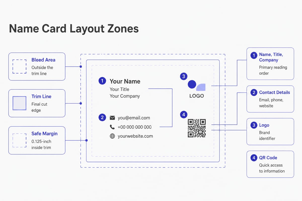
Start with a hierarchy. Your name is the first thing read, the title and company second, and contact details third. Use size and weight to signal that order rather than adding boxes or decorative lines.
Three layout rules hold up across almost every industry:
- Align to a single edge. Left-aligned text on one clear axis looks deliberate. Mixed alignments look accidental.
- Group related lines. Keep phone, email and web together, and separate them from name and title with visible space.
- Protect the margins. Print shops cut cards with slight variation, so content placed too close to the edge risks being clipped.
Margins are measurable. For a standard 3.5 × 2-inch card, VistaPrint's layout guidance gives a full-bleed area of 3.61 × 2.11 inches and a safe area of 3.36 × 1.86 inches. It advises keeping essential text and logos at least 0.125 inches inside the trim line and extending any edge-to-edge artwork into the bleed.
What Typography and Color Work Best?
Legible type in one or two typefaces, with strong contrast between text and background, works better than any decorative choice.
Choose one typeface family and use its weights (regular, medium, bold) to build hierarchy. A second typeface is optional and usually best reserved for the name or company wordmark. More than two creates visual noise on a surface this small.
Size matters because cards are read at arm's length or in poor event lighting. VistaPrint's design rules recommend a minimum body-text size of 8 pt, with 10 to 12 pt or larger for prominent details such as your name and phone number.
For color, limit the palette to your brand colors plus a neutral. Dark text on a light background is the most readable combination. If you use a dark card, increase the type weight slightly, since light text on dark stock appears thinner once printed.
Companies with a corporate identity should pull fonts and colors from the brand guidelines instead of letting each employee choose. This is the point where inconsistency usually starts, and it is much harder to correct after cards are in circulation.
How Do You Prepare a Name Card for Print?
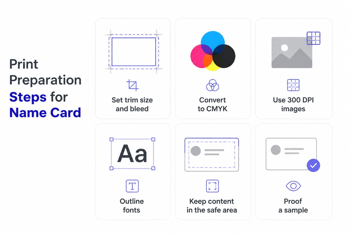
Prepare files with the right resolution, color mode and bleed before sending them to a printer, because most print problems come from file setup rather than the press.
Follow this checklist:
- Set the document to the final trim size, then add bleed on all sides.
- Convert colors to CMYK. Screens use RGB, which can print duller than expected.
- Use raster images at 300 DPI. Lower resolution looks soft on paper.
- Convert text to outlines or embed fonts so nothing substitutes.
- Keep all essential content inside the safe area.
- Proof a printed sample before approving a full run.
The CMYK and 300 DPI recommendations come from VistaPrint's design rules. Vector logos are preferable to raster ones because they scale without losing sharpness.
Stock and finish are a separate decision. Matte stock is easy to write on, gloss shows photography well, and heavier paper signals quality. Special finishes such as metal, wood or transparent plastic make a card memorable, though they also raise cost. Spreadly offers metal, wooden and transparent NFC cards for readers who want a distinctive physical object that still links to a live profile.
What Are the Limits of a Printed Name Card?
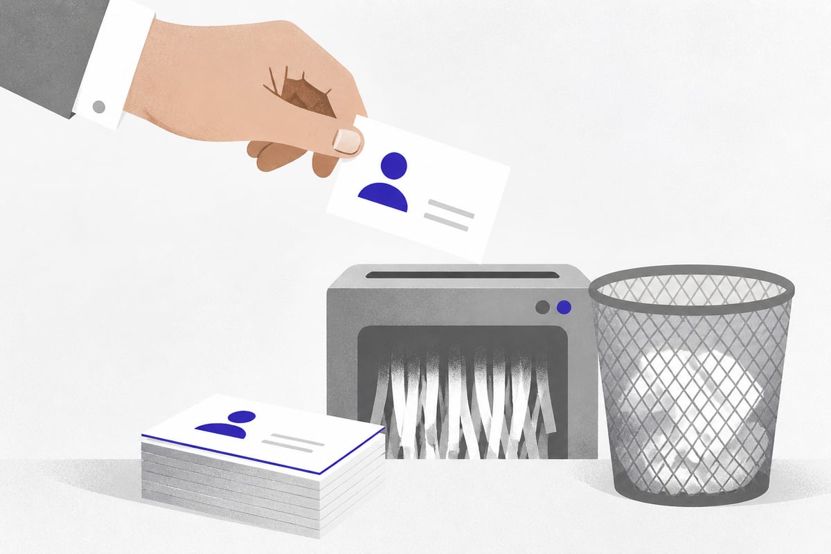
A printed name card is fixed the moment it leaves the press, so any change to a title, phone number or email address makes the stock outdated.
For a single freelancer this is a minor nuisance. For a company with sales staff, it becomes a recurring cost and a data-quality problem. Teams change roles, offices move, and numbers get reassigned. Every old card in a recipient's drawer points to details that may no longer work.
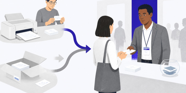
There is also a follow-up problem. A paper card puts the work on the recipient: they must type your details into a phone or scan the card later, and many never do. At a trade show, where a sales rep may collect or hand out dozens of cards in a day, that gap between a handshake and a saved contact is where leads go cold. The hidden costs of paper business cards add up once reprints, waste and lost contacts are counted together.
How Does a Digital Name Card Work at Events?
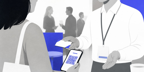
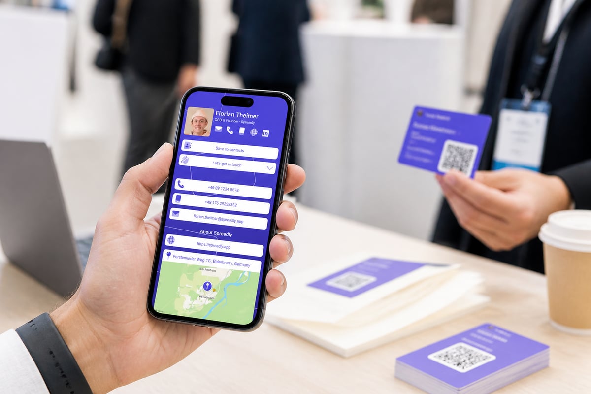
A digital name card replaces fixed print with a link and QR code that open an up-to-date contact page the recipient can save in seconds.
The practical advantages for event teams are specific. Contact details stay current through one link and QR code, so there are no reprints after a job or number change. The recipient taps or scans, saves your details directly and does not have to type anything. If you want a deeper look at the format, this guide to the digital name card explains the basics.
Spreadly's lead capture goes a step further for sales teams: built-in lead forms collect contact details and send them to your CRM, so follow-up can start while the conversation is still fresh. Integrations cover tools such as Salesforce, HubSpot and Pipedrive. The business card scanner reaches 99.9% accuracy across 50+ languages, which helps when you collect paper cards from prospects and need them in your system without retyping. If a company does want a free starting point for individuals, the Free Digital Business Card can be shared by QR code, Apple Wallet, Google Wallet or link, and updated in real time.
The platform is trusted by 250,000+ professionals worldwide and holds a 4.8/5 rating based on 1,100+ reviews. It was also ranked in the OMR Reviews Top 100 Tools 2026.
How Can Companies Keep Every Name Card Consistent?
Consistency across a company comes from managing templates and contact data in one central place instead of letting each employee build their own.
Paper makes this difficult. Each department orders separately, titles are typed by hand, and brand updates take months to reach everyone. The result is mismatched logos, outdated fonts and cards that do not match the email signature the same person uses.
For HR and IT teams, a central system solves three problems at once:
- Branding: logos, fonts and colors are set once and applied to every card
- Data accuracy: details sync from the HR system, so a title change updates automatically
- Signatures: email signatures are managed centrally and stay consistent across the whole company
Spreadly supports this with HR integrations such as Microsoft Entra ID, BambooHR and Personio, plus company-level control over branding. Because Spreadly is GDPR-compliant and based in Munich, it also fits the data-protection expectations of European organizations.
Which Name Card Format Fits Which Situation?
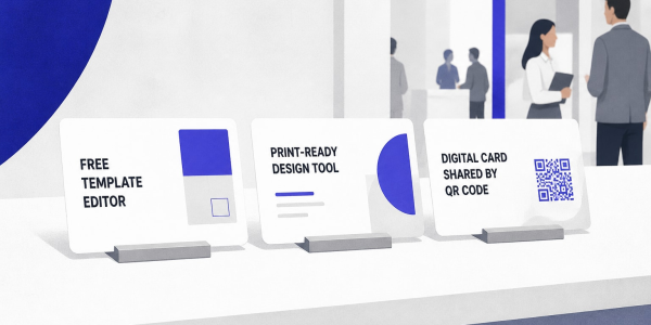
The right format depends on how often your details change, how many people carry cards and whether you need to capture leads.
| Situation | Printed card | Digital card | Combined (NFC card) |
|---|---|---|---|
| Details change often | Poor, requires reprints | Strong, update once | Strong, card links to live page |
| Large team, brand control | Manual and inconsistent | Central templates and sync | Central templates and sync |
| Trade show lead capture | No built-in capture | Lead forms and CRM sync | Lead forms and CRM sync |
| Memorable physical impression | Strong with premium stock | Limited | Strong |
| Recipient effort to save | High | Low | Low |
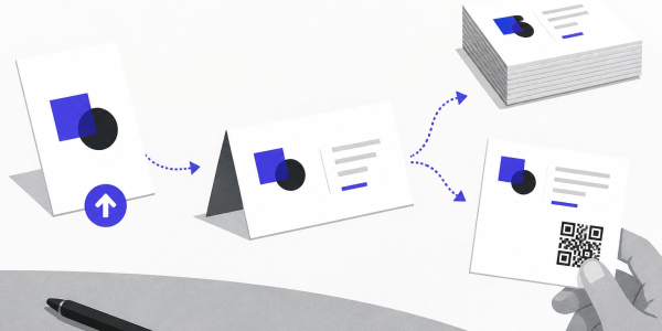
A combined approach often works best. An NFC card gives you something to hand over, and the live profile behind it keeps details accurate.
How Do You Evaluate a Name Card Before Using It?
Test a name card by checking it against a short list of practical questions before it reaches anyone.
- Can the name be read from arm's length in dim light?
- Does the card still look right if it is trimmed slightly off center?
- Is every detail on it one you will still use in a year?
- If it has a QR code, does it scan quickly from a printed copy and open a mobile-friendly page?
- Would the same card look consistent next to your email signature and website?
Run the QR test on the printed proof, not the on-screen file, since print size and contrast affect scanning. If any answer is no, fix it before ordering a full run or rolling it out to the team.
Check your current card against the margin and font sizes above, then decide whether it should link to details you can update without reprinting. If your team attends trade shows and needs every contact captured and passed to the CRM quickly, Try Spreadly free and build a branded digital card in a couple of minutes.