
Best Looking Business Cards: 2026 Design Guide
12 minutes
9th of July 2026
In this article:
- What Makes the Best Looking Business Cards Stand Out
- Premium Materials and Specialty Finishes
- Current Design Trends Shaping Visual Excellence
- Typography and Layout Strategies
- Industry-Specific Design Considerations
- Color Psychology and Brand Alignment
- Digital Integration and Future-Forward Design
- Choosing the Right Printing Service
- Maximizing Business Card Impact
- Design Mistakes to Avoid
- Testing and Refining Your Design
- International Considerations
First impressions matter in business, and nothing communicates professionalism quite like a well-designed business card. Whether you're attending networking events, closing deals, or building your brand, the best looking business cards serve as powerful tools that reflect your identity and values. In 2026, business card design has evolved beyond simple contact information exchanges, incorporating innovative materials, cutting-edge typography, and digital integration that transforms these small rectangles into memorable brand experiences. Understanding what makes a business card visually compelling can give you a significant competitive advantage in today's fast-paced business environment.
What Makes the Best Looking Business Cards Stand Out
The most visually striking business cards share several common characteristics that separate them from generic alternatives. Design excellence goes far beyond choosing an attractive font or color scheme.
Premium business cards command attention through thoughtful composition and strategic design choices. Typography establishes hierarchy and personality, while color palettes reinforce brand recognition. Whitespace creates breathing room that prevents visual clutter and directs the eye to essential information.
Material selection plays an equally crucial role in visual appeal:
- Premium cardstock (32pt or heavier) creates substantial tactile presence
- Textured papers add dimensional interest and sophistication
- Specialty finishes like soft-touch coating enhance perceived value
- Eco-friendly materials demonstrate corporate responsibility while maintaining quality
The business card design trends for 2026 emphasize authenticity and innovation, with designers pushing boundaries while respecting fundamental design principles.
Design Elements That Elevate Visual Appeal
Bold typography has emerged as a defining characteristic of the best looking business cards. Designers are moving away from safe, conventional fonts toward distinctive typefaces that communicate brand personality instantly.
Mixing font weights and styles creates visual interest while maintaining readability. Oversized typography makes bold statements, particularly effective for names or company branding. Custom letterforms or modified fonts demonstrate additional design investment and uniqueness.
Color strategy separates amateur designs from professional work. The most effective cards employ one of three approaches:
- Monochromatic schemes with varying tones for sophisticated simplicity
- Complementary colors that create vibrant contrast and energy
- Analogous palettes that offer harmony and visual cohesion
According to Creative Bloq's logo design trends, brand aesthetics in 2026 favor authenticity and emotional connection, principles that translate directly to business card design.
Premium Materials and Specialty Finishes
Material innovation continues to redefine what's possible with business card design. The best looking business cards in 2026 leverage advanced printing techniques and specialty materials to create unforgettable tactile experiences.
Exploring Material Options
| Material Type | Visual Impact | Best For | Cost Consideration |
|---|---|---|---|
| Thick Uncoated Stock | Natural, sophisticated | Professional services | Moderate |
| Soft-Touch Laminate | Luxury feel, matte finish | High-end brands | Premium |
| Textured Paper | Dimensional interest | Creative industries | Moderate-High |
| Metal or Plastic | Ultra-modern, durable | Technology, innovation | Premium-Luxury |
| Recycled Materials | Eco-conscious, authentic | Sustainability-focused | Moderate |
The VistaPrint business card trends highlight translucent materials and unexpected textures as key differentiators for 2026. These elements transform business cards from purely functional items into conversation starters.
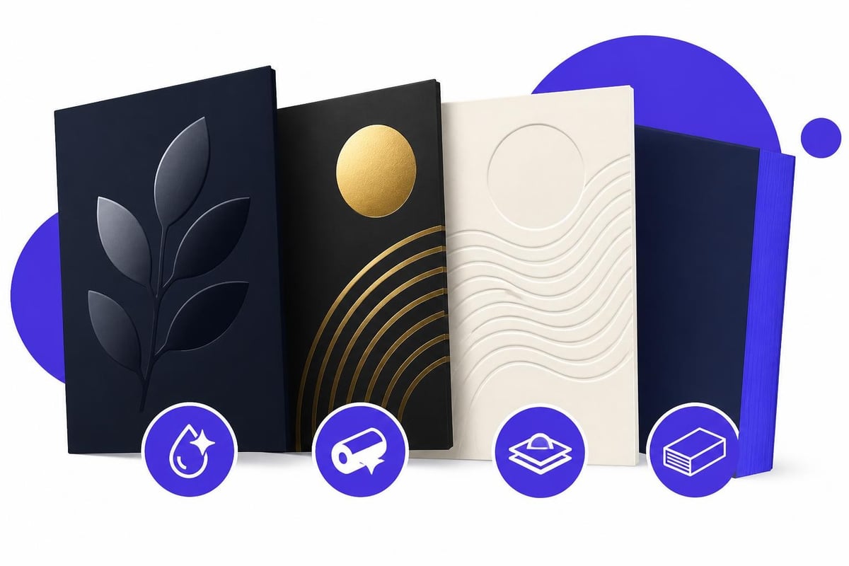
Specialty finishes add another layer of visual sophistication. Spot UV coating creates contrast between glossy and matte areas, drawing attention to logos or key information. Embossing and debossing add three-dimensional elements that engage touch as well as sight. Foil stamping in metallic or holographic finishes elevates perceived value and premium positioning.
Edge painting, where card edges receive colored treatment, offers unexpected detail that delights recipients. Rounded corners soften the overall aesthetic while standing out from standard rectangular cards.
Combining Traditional and Digital Excellence
The evolution toward digital business solutions doesn't diminish the importance of physical card design. Rather, the best looking business cards now bridge both worlds seamlessly.
QR code integration has matured from afterthought to design element. Strategic placement and custom styling ensure codes enhance rather than detract from overall aesthetics. These codes can direct recipients to digital portfolios, contact information, or interactive experiences that extend the card's functionality.
Digital business card solutions complement traditional designs by offering always-current information and rich media capabilities that paper cannot provide. The most forward-thinking professionals maintain both physical cards for face-to-face networking and digital versions for instant sharing across platforms.
Current Design Trends Shaping Visual Excellence
Design trends for 2026 reflect broader cultural movements toward minimalism, sustainability, and technological integration. Understanding these trends helps create business cards that feel contemporary and relevant.
Minimalist Approaches
Ultra-minimalist layouts dominate professional services and technology sectors. These designs strip away decorative elements, focusing exclusively on essential information presented with maximum clarity.
Key characteristics include:
- Generous whitespace that creates visual calm
- Single-color or monochromatic schemes
- Sans-serif typography for clean modernism
- Asymmetric layouts that guide the eye strategically
The modern business card design ideas from industry leaders demonstrate how restraint creates sophistication. Less truly becomes more when executed with precision and intentionality.
Bold and Experimental Designs
Conversely, creative industries embrace maximalist approaches that showcase artistic vision. The best looking business cards in this category feature:
- Vibrant color combinations that demand attention
- Abstract patterns creating visual movement and energy
- Unconventional shapes beyond standard rectangles
- Mixed media elements combining print with other materials
These designs work particularly well for artists, designers, photographers, and other creative professionals where the card itself serves as portfolio evidence.
Sustainable and Conscious Design
Environmental awareness influences design choices across industries. Eco-friendly business cards communicate values while maintaining visual appeal through:
- Recycled paper stocks with visible texture
- Soy-based or vegetable inks
- Minimalist designs requiring less ink coverage
- Plantable cards embedded with seeds
The Optamark design ideas for 2025 emphasize authenticity, and sustainable materials align perfectly with this principle while offering unique aesthetic qualities.
Typography and Layout Strategies
Typography serves as the foundation of effective business card design. The best looking business cards demonstrate mastery of type hierarchy, spacing, and compositional balance.
Font selection communicates brand personality before anyone reads the actual content. Serif fonts convey tradition, reliability, and sophistication. Sans-serif options project modernity, clarity, and approachability. Script or decorative fonts add personality but require careful application to maintain readability.
Professional designers typically limit cards to two or three complementary fonts maximum. More creates visual confusion and dilutes impact.
Creating Effective Hierarchy
Information hierarchy determines what recipients notice first, second, and third:
| Priority Level | Content Type | Typical Treatment |
|---|---|---|
| Primary | Name or company | Largest size, bold weight |
| Secondary | Title or tagline | Medium size, regular weight |
| Tertiary | Contact details | Smallest size, lighter weight |
This structured approach ensures cards communicate efficiently within seconds. Strategic use of size, weight, and positioning guides the eye naturally through information layers.
Layout composition balances symmetry and asymmetry based on brand character. Centered layouts project formality and tradition. Asymmetric designs feel dynamic and contemporary. Grid-based systems create order even within complex information sets.
The Cardify design trends for 2026 highlight how QR codes are becoming integrated design elements rather than awkward additions, demonstrating the importance of holistic layout planning.
Industry-Specific Design Considerations
Different industries require tailored approaches to business card design. The best looking business cards reflect sector-specific expectations while maintaining distinctive personality.
Professional Services
Legal, financial, and consulting sectors favor conservative sophistication:
- Classic typography with serif fonts
- Neutral color palettes like navy, charcoal, and cream
- Premium materials signaling stability and success
- Subtle embellishments like embossing or letterpress
These cards prioritize trustworthiness and established credibility over creative experimentation.
Creative Industries
Designers, artists, and marketers showcase innovation through their cards:
- Unconventional shapes and sizes
- Bold color choices and patterns
- Unique materials like wood, metal, or fabric
- Interactive elements requiring recipient engagement
The card itself becomes a portfolio piece demonstrating creative capabilities.
Technology and Innovation
Tech companies and startups project forward-thinking modernity:
- Clean, minimalist aesthetics
- Sans-serif typography
- Digital integration through NFC or QR codes
- Innovative materials suggesting technological advancement
Digital business cards for teams offer technology companies seamless brand consistency across distributed workforces while maintaining cutting-edge positioning.
Color Psychology and Brand Alignment
Color choices profoundly impact perception and memorability. The best looking business cards leverage color psychology strategically to reinforce brand messaging and emotional resonance.
Color associations vary by culture but generally follow recognized patterns:
- Blue conveys trust, stability, and professionalism
- Red communicates energy, passion, and urgency
- Green suggests growth, health, and environmental consciousness
- Black projects luxury, sophistication, and power
- Orange signals creativity, enthusiasm, and approachability
Effective designs align color choices with brand personality and industry expectations. Financial services rarely use bright orange, just as children's entertainment brands avoid conservative grays.
Creating Cohesive Color Systems
Professional business card design extends brand color systems rather than introducing new palettes. Consistency across touchpoints reinforces recognition and professionalism.
Primary brand colors typically dominate card design, with secondary or accent colors providing contrast and visual interest. The 60-30-10 rule offers a proven framework: 60% dominant color, 30% secondary color, 10% accent color.
Color contrast ensures readability while creating visual hierarchy. Dark text on light backgrounds or vice versa provides necessary legibility. Low-contrast combinations may look sophisticated but sacrifice functionality.
Digital Integration and Future-Forward Design
The best looking business cards in 2026 acknowledge the digital transformation of networking while maintaining physical presence. Integration strategies range from simple to sophisticated.
QR Code Implementation
Custom-designed QR codes represent significant evolution from generic black-and-white squares. Modern implementations incorporate brand colors, logos, or patterns while maintaining scannability.
Strategic placement treats codes as intentional design elements:
- Corner positioning for unobtrusive functionality
- Center placement when codes serve as primary call-to-action
- Back-side integration preserving front aesthetics
QR codes can link to digital business card profiles, portfolio websites, scheduling tools, or promotional content. The versatility makes them increasingly essential for comprehensive networking strategies.
NFC and Smart Cards
Near-field communication (NFC) technology enables instant information transfer through smartphone tapping. These cards appear identical to traditional designs but contain embedded chips.
Smart cards offer several advantages:
- Instant contact sharing without manual data entry
- Analytics tracking when and where cards are shared
- Dynamic content updates without reprinting
- Professional differentiation through technological sophistication
While premium-priced compared to traditional printing, NFC cards position users as innovative early adopters.
Choosing the Right Printing Service
Production quality dramatically impacts final appearance. The best looking business cards require professional printing services with appropriate capabilities for your design vision.
Evaluating Print Providers
Reviewing the best business card printing services reveals significant variation in quality, pricing, and specialty options. Consider these factors when selecting providers:
- Material options matching your design requirements
- Specialty finishes availability and quality
- Print quality consistency and color accuracy
- Turnaround times balancing speed with quality
- Customer service for design assistance and problem resolution
- Pricing transparency with no hidden fees
Request sample packs before committing to large orders. Physical samples reveal paper quality, finish appearance, and color accuracy that digital mockups cannot convey.
Proofing and Quality Control
Professional printing requires careful proofing to avoid costly mistakes:
- Digital proofs verify layout, typography, and general appearance
- Physical proofs confirm material quality and color accuracy
- Bleed and trim specifications prevent unwanted white edges
- Resolution requirements ensure crisp images and text
High-resolution files (300 DPI minimum) prevent pixelation or blurriness. Vector graphics scale perfectly for any size without quality loss.
Maximizing Business Card Impact
Design excellence means little without strategic distribution and follow-up. The best looking business cards support broader networking and relationship-building strategies.
Timing and context influence card exchange effectiveness. Appropriate moments include:
- Formal introductions at networking events
- Concluding productive conversations
- Follow-up after initial digital contact
- Leaving cards with receptionists or gatekeepers
Quality matters more than quantity. Distributing fewer cards to genuinely interested prospects yields better results than mass distribution to disinterested recipients.
Complementing Physical with Digital
Modern networking demands multichannel presence. Physical cards initiate relationships while digital solutions maintain them through easy updates and continued engagement.
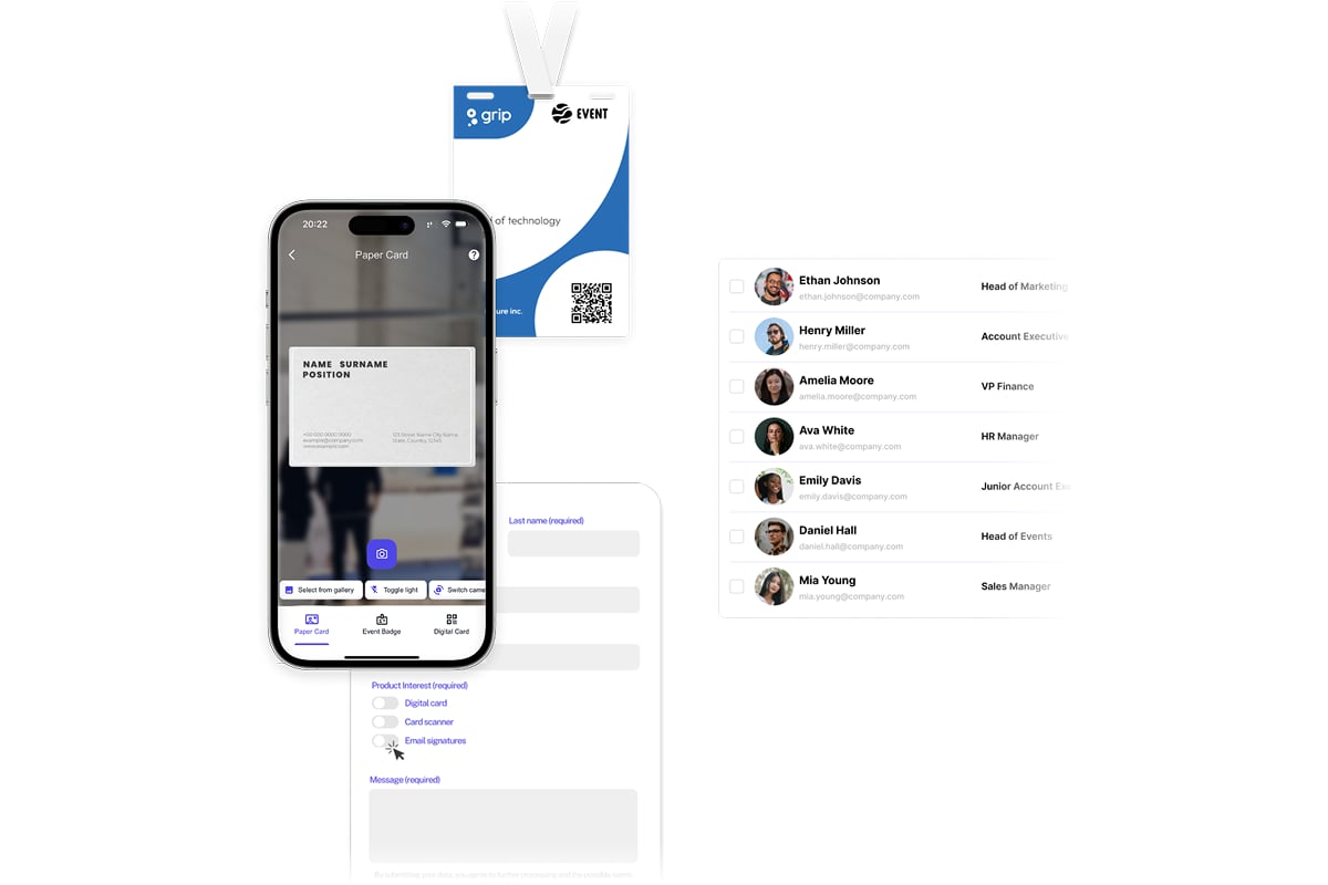
Events and trade shows present particular challenges for managing collected contacts efficiently. Scanning business cards, extracting information accurately, and following up promptly often determines whether initial meetings convert to actual business relationships. Lead capture tools streamline this process, allowing focus on conversations rather than administrative tasks. Modern solutions can scan cards and badges in seconds, use AI to fill missing information, and sync everything directly with your CRM for immediate follow-up.
Digital business cards eliminate the risk of outdated information reaching contacts. Position changes, phone number updates, or address modifications reflect immediately across all shared instances.
Design Mistakes to Avoid
Even beautiful designs fail when they commit fundamental errors. Understanding common pitfalls helps create cards that look professional and function effectively.
Overcrowding Information
Too much content represents the most frequent mistake. Resist the temptation to include every possible contact method, credential, or service offering.
Essential information includes:
- Name and title
- Company name and logo
- Primary phone number
- Email address
- Website or digital profile
Secondary details like social media handles, physical addresses, or multiple phone numbers often create clutter without adding value. Prioritize ruthlessly based on how contacts will actually use the card.
Poor Readability
Aesthetic appeal cannot sacrifice legibility. Font sizes below 8 points challenge readability, particularly for older recipients. Decorative fonts may look beautiful at large sizes but become illegible at business card scale.
Insufficient contrast between text and background creates similar problems. Light gray text on white backgrounds or dark blue on black may appear sophisticated on screen but fail in actual use.
Inconsistent Branding
Business cards must align with broader brand guidelines. Color mismatches, different logo versions, or contradictory design styles confuse recipients and undermine brand recognition.
Professional brands maintain comprehensive style guides specifying exact color values (CMYK for print), approved fonts, logo usage rules, and design principles. Adhering to these guidelines ensures consistency across all touchpoints.
Testing and Refining Your Design
The best looking business cards emerge from iterative design processes rather than single attempts. Professional designers create multiple concepts, gather feedback, and refine repeatedly.
Mockup testing reveals how designs appear in physical form. Digital screens display colors differently than printed cards, and scale perception changes dramatically between monitor viewing and hand-held cards.
Print small test batches before committing to large quantities. Distribute samples to trusted colleagues requesting honest feedback on:
- First impressions and visual appeal
- Readability and information clarity
- Material quality and tactile feel
- Brand alignment and professionalism
- Memorable elements or differentiators
Incorporate constructive feedback while remaining true to core brand identity. Design by committee rarely produces excellence, but informed perspectives identify blind spots and improvement opportunities.
A/B Testing for Optimization
Business professionals with significant networking activity might test design variations to identify highest-performing options. Create two or three distinct designs and track:
- Retention rates measuring how many recipients keep cards versus discarding
- Follow-up frequency indicating which designs prompt action
- Conversation starters noting which elements generate discussion
- Recall testing asking contacts what they remember about your card
Data-driven insights reveal which aesthetic choices, information hierarchies, or material selections resonate most effectively with your target audience.
International Considerations
Global business requires awareness of cultural design preferences and practical considerations. The best looking business cards adapt appropriately for international contexts.
Cultural symbolism varies significantly across regions. Colors carry different meanings: white symbolizes purity in Western cultures but mourning in some Asian contexts. Red signals danger in Western traditions but good fortune in Chinese culture.
Layout conventions differ internationally as well. Western designs typically emphasize individualism through personal names and titles, while some Asian cultures prioritize company affiliation. Two-sided cards with one side in local language demonstrate respect and professionalism.
Practical specifications change by region. Standard North American cards measure 3.5 x 2 inches, while European cards typically use 85 x 55mm (slightly narrower). Japanese cards often run slightly larger to accommodate complex characters.
Research cultural norms and practical expectations before designing for international distribution. Partnering with local designers or cultural consultants helps avoid unintended offense or confusion.
Creating the best looking business cards requires balancing aesthetic excellence with strategic functionality, ensuring your first impression translates into lasting business relationships. Whether you choose premium printed cards with specialty finishes or embrace digital solutions that offer instant updates and rich media integration, your business card represents your professional brand in tangible form. Spreadly provides modern digital business cards that combine stunning customizable design with powerful features like instant sharing via QR codes, NFC cards, and Apple/Google Wallet, ensuring your contact information stays current while delivering the polished, professional impression that drives meaningful connections and business growth.